
1. Data Download
Ask your teacher for instructions on how to access the project data.
2. Data Analysis
The downloaded dataset can be opened in Microsoft Excel, Google Sheets, or any other program that can open Excel (.xlsx) files.
Look at the data and think about the following questions:
- Data was recorded about indoor environments. What is data?
- Is this data discrete (something that can be counted) or continuous (measured using tools)?
- Is any of the data extreme (outside of reasonable expectations)?
- Does the data contain ranges in the values that look suspicious?
- What type of graph would best represent this type of data?
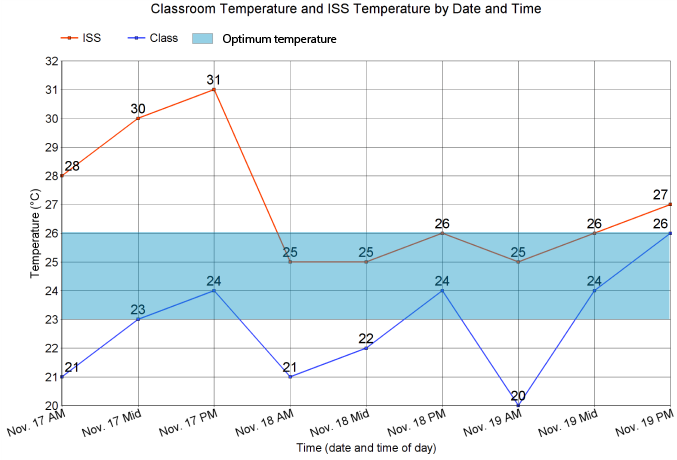
Graphing
Using the dataset your teacher provides, create line graphs representing the environmental condition(s) that the class measured. You should graph the data from your classroom and the data from the ISS on the same graph, for example:
- Temperature vs. time
- Relative Humidity vs. time
- Carbon Dioxide vs. time
Each graph should include:
- A title
- Labelled x and y axes
- A legend or key
- Neatly drawn data points and lines
- Appropriate increments
- Shaded area which indicates the optimum range for that environmental condition
You may choose to do your graphs on paper or use an online graphing program such as:
- Google Sheets
- Chartgo is an online chart creator that lets you create a variety of charts include bar charts, line charts, pie charts and area charts. Data can be imported from Excel or CSV.
- Create a Graph, from the National Centre for Education Statistics (USA), is a good tool for online graphing (Note: Requires Macromedia Flash Player).
- Chart Tool is a powerful online charting and graphing tool. It is somewhat complex, but provides excellent visualization possibilities.
Patterns and Trends
Look at the graphs and describe what you observe. Be on the lookout for:
- High and low points
- Patterns
- Trends (values increasing or decreasing)
- Whether or not the data is in the optimal range
What do you think might be causing the patterns and trends you observed?
Compare to a Standard
You will now compare the environmental data you collected in the classroom with recommended guidelines for indoor environments.
Use the charts below to answer the following questions:
- How does your classroom temperature, relative humidity, and/or carbon dioxide level compare to recommended guidelines for indoor environments?
- Do you think the time of day influences whether each classroom environmental variable measures within an acceptable range?
- If any of your measurements fall outside of the acceptable range, what might be the contributing factors?
- Why do you think the recommended guidelines for temperature and relative humidity vary by season?
Temperaturei,iv
|
Summer Conditions |
Winter Conditions |
|---|---|
|
23–26°C (optimum 24.5 °C) |
20–23.5 °C (optimum 22 °C) |
Relative Humidityii,iv
|
Summer Conditions |
Winter Conditions (<-10 °C) |
|---|---|
|
30–50% |
30% |
Carbon Dioxidei,iii
| 350–450 PPM | Typical outdoor range |
|---|---|
|
800-1200 PPM |
Typical indoor range |
|
<1200 PPM |
Recommended indoor concentrations Note: In indoor settings, carbon dioxide generally should not be greater than 700 ppm above outdoor carbon dioxide levels; this typically corresponds to indoor concentrations below 1,200 ppm. |
|
>5000 PPM |
Exceeds recommended short-term exposure limit during an 8-hour workday. Note: This is not an acceptable constant level for indoor spaces. Some hazardous professions like astronauts and welders may tolerate these upper limits but will take counteracting measures. |
Note: even if environmental measurements fall within the above recommended ranges for temperature, relative humidity and carbon dioxide, the comfort of an indoor environment may also be influenced by other factors such as a person’s activity level, clothing, airspeed, or sunlight.iv
References:
- iGuidelines on ventilation, thermal comfort and indoor air quality in schools (UK Department of Education, 2016)
- iiMeasuring Humidity in Your Home (Canada Mortgage and Housing Corporation, 2009)
- iiiOccupational Exposure Limits (The National Institute for Occupational Safety and Health, 2018)
- ivThermal Comfort for Office Work (Canadian Centre for Occupational Health and Safety, 2023)