Data as Art

Coloured pencil graph (PeskyMonkey, iStockphoto)
Coloured pencil graph (PeskyMonkey, iStockphoto)
How does this align with my curriculum?
Learn about how data can be used to blend math and art.
Data is everywhere. Take a look around you. Everything that you see is either using data or can be converted into data. For example, how many people in your class wear shoes vs. boots, or other types of footwear? How many points did your favourite team score last season? Who lives on your street? What do they do? Who are they related to? What television shows do they watch? All of this is data.

Student birthdays by month (©2022 Let’s Talk Science).
Image - Text Version
Shown is a bar graph featuring orange bars on a light blue background.
At the top is the title, “Student Birthdays” in red capital letters. Below that is the subtitle, “by Month” in black. The Y axis starts at 0 and goes up to 25 in intervals of 5. The X axis are the months of year in order from left to right. Each of the bars has its value at the top in black. January has 22 student birthdays; February has 8; March has 12; April has 20; May has 16; June has 19; July has 8; August has 4; September has 2; October has 8; November has 18; and December has 22.
Question 1:
Without looking again at the graph above, what was it about? Which month had the most birthdays? Which month has the fewest birthdays?
One way that we can help people think about data on a deeper level is by making it into art. Doing this can help people convey important information in an interesting way. Numbers alone may not be remembered. But images created from data have a better chance of sticking around in someone’s mind. Using the elements of art, data can be turned into data visualization.These visualizations, if done well, can draw the viewer into the story that data is trying to tell.
Examples of Data as Art

Warming stripes: Global temperature change from 1850 to 2021 (Source: Ed Hawkins [CC BY 4.0]).
Image - Text Version
Shown are a series of vertical stripes whose colours range from dark blue to dark red.
The stripes on the left hand side of the image range from dark to medium blue. Approximately halfway through the image the stripes lighten. Three-quarters of the way from left to right the stripes darken into red, and the last several stripes on the far right of the image deepen into a dark red that borders on maroon.

Global temperature change from 1850 to 2021 (Source: Ed Hawkins [CC BY 4.0]).
Image - Text Version
Shown is a densely populated bar graph. The Title at the top reads “Global temperature change.” The subtitle reads “Relative ot average of 1971-2000 (℃)”
On the Y axis, the label ranges from -0.6 to 0.6, bottom to top. The X axis is labeled by year, beginning in 1850 at the left and ranging to 2021 at the far right. The bars whose values are below 0 are in blue, which lighten the closer they are to 0. The bars whose values are above 0 are red, darkening as they go further above 0. Up until approximately 1980 the bars are blue, although they begin to lighten in a trend beginning around 1940. Around 2000 the bars darken, becoming much darker a few years before 2021.
Question 2
Which of the two graphs above did you find more interesting to look at? Which graph do you think you will remember after reading this article?
Question 3
How could you recreate the birthday graph above using colour to tell the story?
Question 4
What is a possible downside of using colour as a source of information?
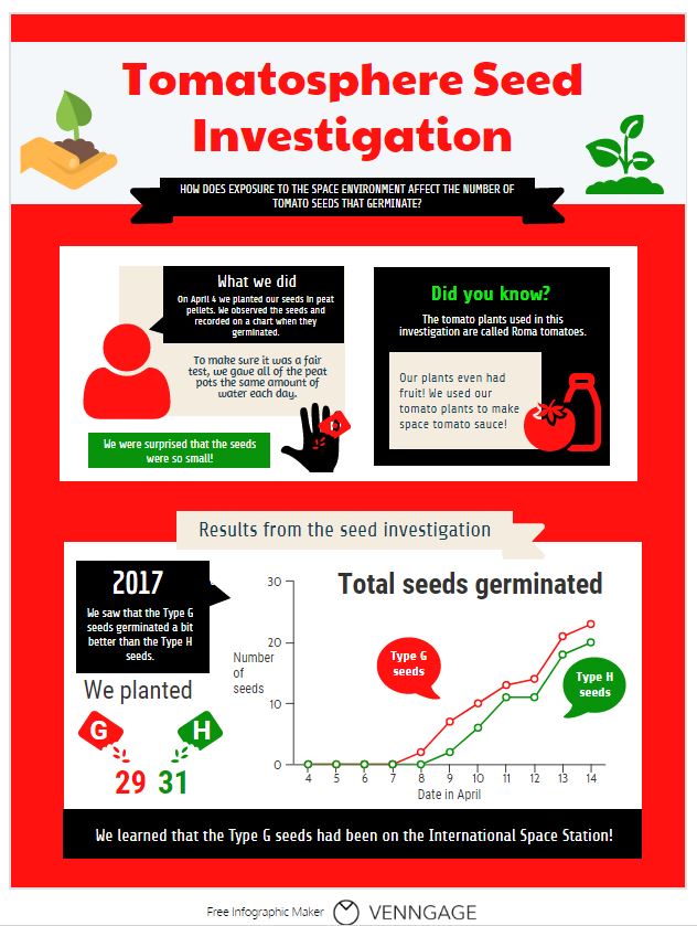
Tomatosphere™ Seed Investigation infographic (© 2018 Let’s Talk Science).
Image - Text version
Shown is a colour infographic that illustrates a Tomatosphere Seed Investigation.
The title, Tomatosphere Seed Investigation, is printed in large red letters across the top of the illustration. The subtitle, How Does Exposure to the Space Environment Affect the Number of Tomato Seeds That Germinate? is in smaller white letters on a black banner underneath.
Left of the title, a hand holds a pile of soil with a small tomato plant growing from it. Right of the title is a larger green tomato plant in soil.
The three panels below are bordered in red.
The first panel shows a red icon of a human figure with head and shoulders visible. Its speech bubble is black with white letters. At the top of the bubble, in large letters is the title "What we did". In smaller letters below, is the text: "On April 4, we planted our seeds in peat pellets. We observed the seeds and recorded on a chart when they germinated." Below the speech bubble, on a beige background, is the text: "To make sure it was a fair test, gave all of the peat pots the same amount of water each day." At the bottom left corner of the panel, in a green rectangle, is the text: "We were surprised that the seeds were so small!" To the right of this rectangle is an illustration of a hand, in black, with red seeds in it and a magnifying glass over top.
The second panel is a black rectangle with the title Did You Know? in large green letters. In smaller white letters below is the text: The tomato plants used in this investigation are called Roma tomatoes. In a beige rectangle below is the black text: Our plants even had fruit! We used our tomato plants to make space tomato sauce! To the right of this text is a red illustration of a tomato next to a bottle.
The third panel, on the bottom, is double the size of the other two, with a white background. A beige banner along the top has the title: Results from the seed investigation. A speech bubble on the top left reads, "2017. We saw that the Type G seeds germinated a bit better than the type H seeds." Below is an illustration of a red packet labelled G and a green packet labelled H, with seeds pouring out of them. Under the red packet is the number 29. Under the green packet is the number 31.
To the right is a line graph. The Y axis is labelled number of seeds from 0 to 30. The X axis is labelled Dates in April. A climbing red line is labelled Type G seeds. This starts on April 7 and stretches up to about 23 seeds. A climbing green line is labelled Type H seeds. It starts on April 8 and stretches up to 20 seeds.
A thick black stripe across the bottom of the infographic says, in white letters: We learned that the Type G seeds had been on the International Space Station!
Question 5
Either by hand, or using a free online program, create an infographic based on the information in the student birthday graph. Be sure to include pictures, numbers and colour!

Relief Map of the Gamburtsev Subglacial Mountains in Antarctica (Source: Dr. Tom Jordan, British Antarctic Survey. Used with permission).
Image - Text Version
Shown is a relief map coloured brightly in blue, purple, yellow, red, and white.
Regions on the map that are below sea level or are water are coloured in blue. There is one large lake in the bottom right corner, some small ponds in the bottom left corner, a large collection of thin lakes in the top right corner, and small amounts of water in the top left and along the top border near the center.
Roughly two-thirds of the way down, a range of large hills and small peaks are coloured in purple, surrounded by dark red foothills. The top third of the image is dominated by a mass of tall white peaks with smaller purple peaks surrounding them. A branch of purple small peaks leads off through the top right of the image. Lower dark red foothills lead off through the top left of the image. The areas between the foothills is coloured yellow. On the far right side of the image is a wide plateau coloured yellow-red.
Interactive Visualizations

Screenshot from music.ishkur.com
Image - Text Version
Shown is a large map of musical genres.
The bottom of the image contains the title, in stylized neon blue letters: “Ishkurs Guide To Electronic Music.” This title is repeated in a large clear area in the top left of the image. The top of the image is a range of years going from “1900s” on the far left to “2010s” on the far right. The rest of the image contains musical genres that are connected together with lines and placed on the image corresponding to the decade when they were developed. The major genres are displayed in bold golden font, and the subgenres of these are displayed in smaller white text. Each of the major genres is represented by different coloured lines along the continuum.
The Sound of Data
Sonification is the art of turning data into sound. In some cases, this can mean turning data into music.
Variables and quantities can be converted into musical instruments and notes. For example, each month of the class birthdays could be a different instrument and each value could be a different note on a scale.
Mars weather patterns used to create incredible music (2020) from the Daily Mail (1:13 min.)
"Hear Climate Data Turned Into Music" (2018). KQED SCIENCE (1:33)
Question 6
What is a possible downside of using sound as a source of information?
Making Your Own Data Visualization
There are lots of ways that you can do this. Think about the following questions when you want to present data in an interesting way.
What does your data say?
- First you need to know the story of your data. What is it telling you? Is there a trend or pattern in the data that is important for people to understand?
- Make sure that your data is accurate! This will give your data visualization credibility. Including the source of your data is important. This may be data you collected yourself, or data you got from somewhere else.
What do you want people to focus on?
- There will probably be a lot of different stories that come out of the data in front of you. Not all of these stories will be important. What is it you want people to notice? Whatever it is, you want people to remember it. Cluttering your visualization with things that don’t matter can confuse and distract people.
What’s the best way to display your data?
- Different types of data require different types of display. Certain types of data will lend themselves certain types of visualizations. For example, is your data something you can count (discrete) or something that varies over time (continuous)?
- It's a good idea to start simple and gradually get more complex. A simple visualization can be as artistic as a complicated one.
How could your design stand out in people’s minds?
- Be creative! Could the pie chart be a basketball? Could the bars in the bar graph be a player jumping to dunk in sequence? Once you have the basic form of the presentation down, you can start to get creative.
- Don’t be afraid to think outside the box! Use different lines, shapes, styles, and especially colours to make the story in your data stand out. This is where the art comes in.
See the Learn More section below for websites that showcase some amazing data visualizations.
Answers
Question 1
It’s okay if you don't remember. December and January were tied for the most birthdays. September had the fewest birthdays.
Question 2
This is a subjective question, meaning there is no right answer. How interesting something is is a matter of opinion.
Question 3

Student birthdays by month (©2022 Let’s Talk Science).
Image Text - Version
Shown is a coloured chart of student birthdays by month.
The title across the top is in different shades of purple and reads "Student Birthdays by Month."
The chart shows each of the months of the year with different shades of purple. A legend across the bottom shows the scale of the number of student birthdays, ranging from 0 to 25. The shades of purple grow darker as the number of student birthdays increase.
Question 4
Not all people perceive colour the same way. Some people have colour vision deficiency, often called colour blindness. This does not allow them to see or understand all of the colours of the rainbow. Other people have other visual impairments or low vision which can mean that they do not see well, or do not see at all.
Question 5
How did your infographic turn out?
Question 6
Similar to question 4, by having sound alone convey the message, you are not making the information accessible to a person with a hearing impairment or deafness.
Learn More
Who is bottling plastic waste pollution?
This data visualization includes information about how much plastic waste countries produce and how the oceans are impacted. At the top of the page are sketches of how the artist planned out the visualization.
World’s biggest iceberg heads for disaster (2021)
This page has several interesting data visualizations. It includes an infographic about how icebergs move around Antarctica. It also has an infographic that compares the size of Iceberg A68a to countries and islands around the world
Cell phone towers map of the world
This is a data visualization of 40 million cell towers around the world. You can scroll around and zoom in and out on the map.You can even see the ratio of networks (2G, 3G and 4G).
The Moon As Art
NASA's “Moon As Art” campaign was about selecting the most stunning images from the Moon collected by the Lunar Reconnaissance orbiter. You can see images in this photo gallery.
References
Benzi, K. (n.d.). What is Data Art? A definition.
British Antarctic Survey. (n.d.). Data As Art.
Grugier, M. (2016). The digital age of data art. techcrunch.com