Infographic Creator
Infographic creator icon (made using Piktochart)
Infographic creator icon (made using Piktochart)
How does this align with my curriculum?
This strategy helps students communicate data and information through the creation of infographics.
Why use it?
- To support the development of student visual literacy skills
- To enable students to become familiar with different ways of visualizing data
- To assist students with understanding techniques for displaying data so that it is visually interesting for the reader
- To help students learn the ‘rules of thumb’ for creating effective infographics
Tips for success
- If you are not familiar with infographics, take some time to review the websites in the reference list. Included are websites that provide tips for creating good infographics as well as for avoiding common mistakes.
- Preview and try out the different infographic programs and find one that you like.
- Encourage students to look at multiple examples of ‘good’ infographics for inspiration.
- Students should be familiar with various data display options and their uses such as pie charts, bar graphs, line graphs, flow charts, etc. (see 33 Ways to Visualize Ideas)
- Teach/review design elements such as complementary colours, fonts, and use of space.
How do I use it?
- Begin by assessing students’ familiarity with infographics (short for “information graphic”). Students have probably seen examples of these types of graphics in everyday life (e.g., online, in magazines, in ads, etc.), but may not be aware that these images are called infographics.
- Explain/review that an infographic uses visuals supported by text to represent information and/or data. Infographics are an effective and creative way to convey a large amount of information and data quickly through the use of visuals such as graphs, charts, diagrams, time lines, maps, images, icons, etc. What infographics do NOT have is a lot of text. Much of what would normally be text is REPLACED by imagery such as illustrations and icons.

Image - Text version
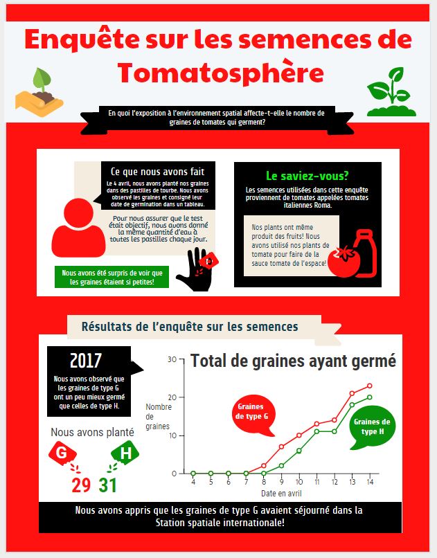
Shown is a colour infographic that illustrates a Tomatosphere Seed Investigation.
The title, Tomatosphere Seed Investigation, is printed in large red letters across the top of the illustration. The subtitle, How Does Exposure to the Space Environment Affect the Number of Tomato Seeds That Germinate? is in smaller white letters on a black banner underneath.
Left of the title, a hand holds a pile of soil with a small tomato plant growing from it. Right of the title is a larger green tomato plant in soil.
The three panels below are bordered in red.
The first panel shows a red icon of a human figure with head and shoulders visible. Its speech bubble is black with white letters. At the top of the bubble, in large letters is the title "What we did". In smaller letters below, is the text: "On April 4, we planted our seeds in peat pellets. We observed the seeds and recorded on a chart when they germinated." Below the speech bubble, on a beige background, is the text: "To make sure it was a fair test, gave all of the peat pots the same amount of water each day." At the bottom left corner of the panel, in a green rectangle, is the text: "We were surprised that the seeds were so small!" To the right of this rectangle is an illustration of a hand, in black, with red seeds in it and a magnifying glass over top.
The second panel is a black rectangle with the title Did You Know? in large green letters. In smaller white letters below is the text: The tomato plants used in this investigation are called Roma tomatoes. In a beige rectangle below is the black text: Our plants even had fruit! We used our tomato plants to make space tomato sauce! To the right of this text is a red illustration of a tomato next to a bottle.
The third panel, on the bottom, is double the size of the other two, with a white background. A beige banner along the top has the title: Results from the seed investigation. A speech bubble on the top left reads, "2017. We saw that the Type G seeds germinated a bit better than the type H seeds." Below is an illustration of a red packet labelled G and a green packet labelled H, with seeds pouring out of them. Under the red packet is the number 29. Under the green packet is the number 31.
To the right is a line graph. The Y axis is labelled number of seeds from 0 to 30. The X axis is labelled Dates in April. A climbing red line is labelled Type G seeds. This starts on April 7 and stretches up to about 23 seeds. A climbing green line is labelled Type H seeds. It starts on April 8 and stretches up to 20 seeds.
A thick black stripe across the bottom of the infographic says, in white letters: We learned that the Type G seeds had been on the International Space Station!
- Begin by showing the students an image of an infographic which follows the guidelines below. It can be on any topic (just search for a given topic and use the word “infographic” in the search). Below are some good examples:
- Display the infographic on a projection screen or have students view on a computer/tablet screen. Note: Infographics can be unusually long or wide, so you may need to pan around the screen or scroll down as students view the infographic.
- Divide students into small groups and provide each with a paper copy of the Infographic Rubric. Review the rubric criteria with the students. Explain that a good infographic:
- Has an interesting title which describes the main topic
- Uses data visualization formats that are appropriate for type of information being presented (e.g., a map for locations, a pie chart for percentages, etc.)
- Uses images and text which effectively communicate the topic
- Uses a limited number of colours which are visually pleasing and enhance the readability of the infographic
- Has a layout which is not too cluttered and leads the eye to all information
- Is readable (text isn’t too small or in a hard-to-read font)
- Includes a list of sources for the data
- Repeat the activity this time using an infographic that would NOT score well on the rubric and have students use the rubric on the back side of the page to assess the infographic. To find a good sample infographic, type “worst infographics” into a search engine. Below are two examples:
- Now that students have seen both a good and bad example, they can work on creating their own infographics using the guidelines on the rubric for the Tomatosphere™ Investigation. An exemplar of a Tomatosphere™ Investigation infographic can be found in the Using this Strategy section below. Students should plan how they will represent the inquiry process as well as the results of the investigation. It is best to do this in the form of rough notes and drawings before going online. They should also be encouraged to watch any video tutorials offered by the infographic design web program you choose to use.
Variations
- Students can create infographics either by hand on paper or using an online program. See the References and Additional Resources section below for some free online infographic creation programs.
- The rubric can be differentiated according to grade level, topic and assessment focus (E.g., science, language arts, visual arts, etc.).
Using this Strategy
Infographic Rubric [Google doc] [.pdf]
Infographic example from Tomatosphere™ [jpeg]
Tips for creating quality infographics
Crash Course in Infographics (2015)
This pdf download from easel.ly is a crash course on infographics. It includes checklists, step-by-step instructions as well as tips and best practices for creating infographics.
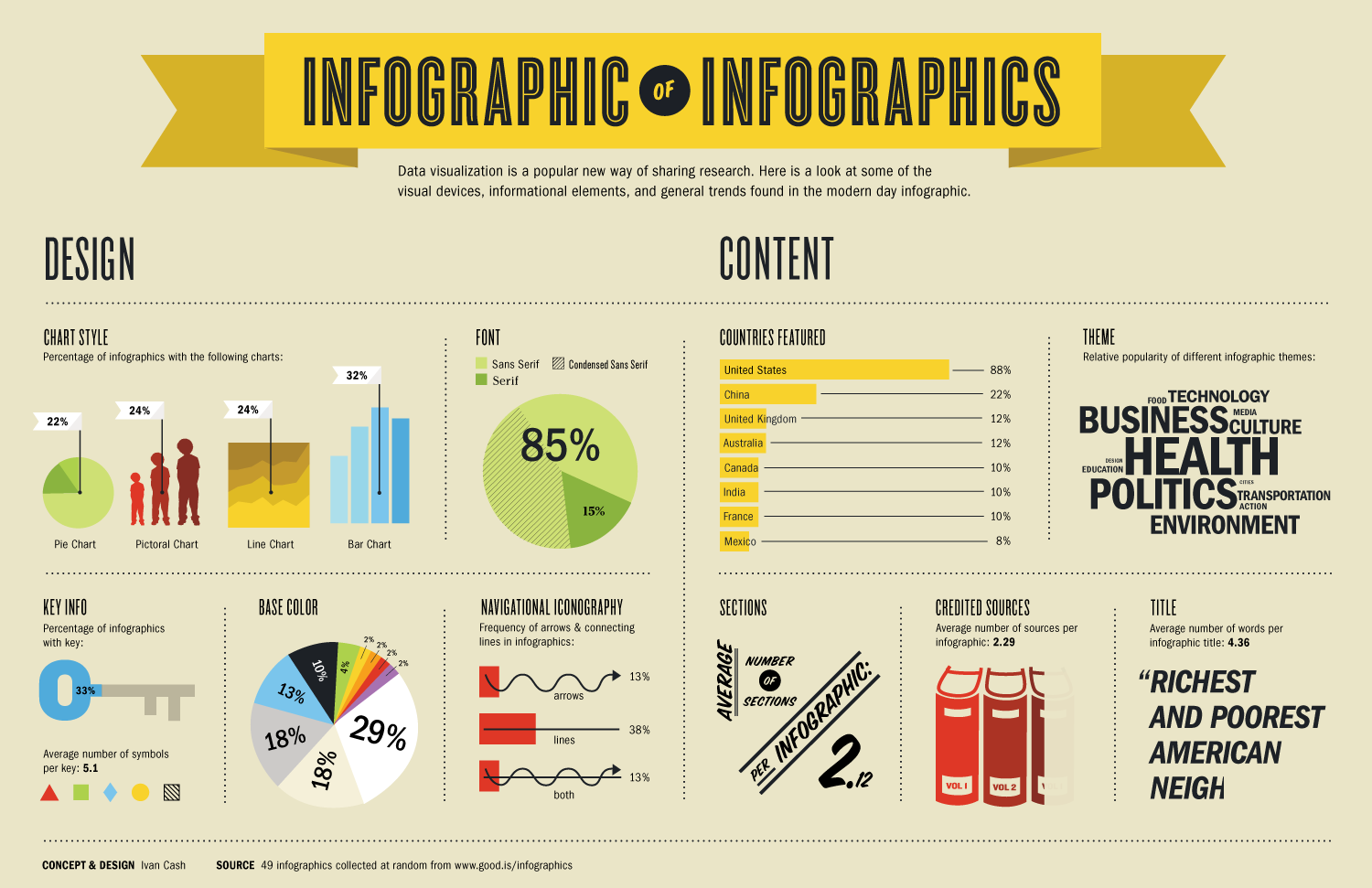
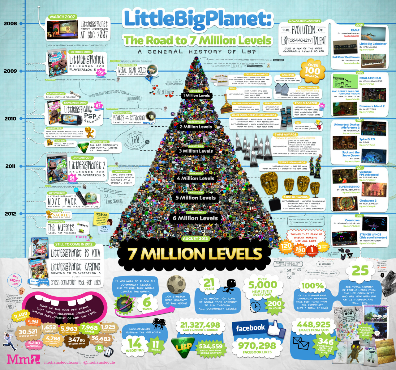
This image, from Infographic List, is an infographic about Infographics. This website has many examples of infographics that could be used as examples for this learning strategy.
Types of Graphs (2015)
This website has explanations and examples for many types of graphs and when/how they should be used.
This image, from FundersandFounders.com, is an infographic about the “33 ways to visualize ideas.” This would be a good handout for students.
Top Tips from Experts on What Makes a Great Infographic (2014)
This blog post from easel.ly (an online infographic program) has tips from experts on what makes a great infographic.
12 Infographic Tips That You Wish You Knew Years Ago
This blog post from Kissmetrics (a blog about analytics, marketing and testing) has tips for making a good quality infographic.
Bad Infographics: 11 Mistakes You Never Want to Make
This blog post from visme.co (an online infographic program) lists 11 common infographic mistakes.
Infographics in the Classroom
Piktochart in the Classroom: Infographics & Education (2016)
This blog post from Piktochart (an online infographic program) has links to ideas for using infographics in a variety of classroom settings.
How to Use Piktochart in Any (and Every) Classroom (2016)
This blog post from Piktochart (an online infographic program) explains how to use infographics in the classroom and includes video tutorials.
Infographics as a Creative Assessment (2020)
This web page, from Kathy Schrock’s Guide to Everything, has instructions for using infographics as a creative assessment tool. There is also a companion video on vimeo
A Picture IS Worth a Thousand Words: Using Infographics to Illustrate How-to Writing.
This lesson plan, on the readwritethink website, A Picture IS Worth a Thousand Words: Using Infographics to Illustrate How-to Writing explores how infographics can be used to illustrate procedural writing.
Top Tips from Experts on What Makes a Great Infographic (2014)
This blog post from easel.ly (an online infographic program) has tips from experts on what makes a great infographic.
Free Infographic design programs
10 free tools for creating infographics (2019)
This web page, from Creative Bloq, has a list of what they consider to be the 10 best free infographic tools.

Image - Text version
Shown is an infographic comparing the features of five different free programs that can be used to create infographics.
This infographic is long and thin with a royal blue background and green, white, and bright blue text and graphics. There are five sections stacked vertically, and each one is separated by a thin, green horizontal line with squares at each end.
At the top centre, in three different white fonts, is the title, Comparing Infographic Programs You can use for free.
In a long, horizontal, white rectangle below are the logos of the five programs being compared: Canva, Visme, Piktochart, Easel.ly and Venngage.
Below is a bar graph labelled: Free templates: Who has the most? The Y axis is marked from 0 to 100 and the Y axis has a blue bar for each program. Easel.ly's bar shows it has about 10 templates. Piktochart's shows about 11 templates. Visme's shows about 20 and Canvas' almost 50. Venngage's bar reaches 100 templates, and there is a white plus sign in the middle of the bar.
In the section below, a chart is labelled Free download formats with the word download in large white block letters. There is a row for each program, and a list of available formats beside each one. No formats appear beside the word Venngage. JPEG appears next to Visme, Easel.ly, Piktochart and Canva. PNG appears next to Piktochart and Canva. PDF appears next to Canva, and PDF Print also appears next to Canva.
Next is a section with the title Selection of Free Elements: Shapes, lines, charts, on the left. On the right are two lists: one with the heading Lots and one with the heading Not Many. Canva, Picktochart and Venngage are on the Lots list. Easel.ly and Visme are on the Not Many list.
The last section has the title Free Special Features at the centre top. To the left of the title is an illustration of a world map, with folds. To the right is an illustration of 12 lightbulbs laid out in a square. Seven lightbulbs are green and five are blue.
Below is a chart with rows for each program, and columns labelled pictograms, maps, interactives, and colour schemes. Visme and Piktochart have four check marks, one in each column. Venngage has green check marks under pictograms, maps and interactives, and a blue X under colour schemes. Canvas has check marks under interactives and colour schemes, and blue Xs in the other columns. Easel.ly has a check mark under interactives, and all other columns have blue Xs.
Rubric and Exemplar
Infographic Rubric [Google doc] [.pdf]
Infographic example from Tomatosphere™ [jpeg]
Additional Resources
Tips for creating quality infographics
Crash Course in Infographics (2015)
This pdf download from easel.ly is a crash course on infographics. It includes checklists, step-by-step instructions as well as tips and best practices for creating infographics.
This image, from Infographic List, is an infographic about Infographics. This website has many examples of infographics that could be used as examples for this learning strategy.
Types of Graphs (2015)
This website has explanations and examples for many types of graphs and when/how they should be used.
This image, from FundersandFounders.com, is an infographic about the “33 ways to visualize ideas.” This would be a good handout for students.
Top Tips from Experts on What Makes a Great Infographic (2014)
This blog post from easel.ly (an online infographic program) has tips from experts on what makes a great infographic.
12 Infographic Tips That You Wish You Knew Years Ago
This blog post from Kissmetrics (a blog about analytics, marketing and testing) has tips for making a good quality infographic.
Bad Infographics: 11 Mistakes You Never Want to Make
This blog post from visme.co (an online infographic program) lists 11 common infographic mistakes.
Infographics in the Classroom
Piktochart in the Classroom: Infographics & Education (2016)
This blog post from Piktochart (an online infographic program) has links to ideas for using infographics in a variety of classroom settings.
How to Use Piktochart in Any (and Every) Classroom (2016)
This blog post from Piktochart (an online infographic program) explains how to use infographics in the classroom and includes video tutorials.
Infographics as a Creative Assessment (2020)
This web page, from Kathy Schrock’s Guide to Everything, has instructions for using infographics as a creative assessment tool. There is also a companion video on vimeo
A Picture IS Worth a Thousand Words: Using Infographics to Illustrate How-to Writing.
This lesson plan, on the readwritethink website, A Picture IS Worth a Thousand Words: Using Infographics to Illustrate How-to Writing explores how infographics can be used to illustrate procedural writing.
Top Tips from Experts on What Makes a Great Infographic (2014)
This blog post from easel.ly (an online infographic program) has tips from experts on what makes a great infographic.
Free Infographic design programs
10 free tools for creating infographics (2019)
This web page, from Creative Bloq, has a list of what they consider to be the 10 best free infographic tools.
Image - Text version
Shown is an infographic comparing the features of five different free programs that can be used to create infographics.
This infographic is long and thin with a royal blue background and green, white, and bright blue text and graphics. There are five sections stacked vertically, and each one is separated by a thin, green horizontal line with squares at each end.
At the top centre, in three different white fonts, is the title, Comparing Infographic Programs You can use for free.
In a long, horizontal, white rectangle below are the logos of the five programs being compared: Canva, Visme, Piktochart, Easel.ly and Venngage.
Below is a bar graph labelled: Free templates: Who has the most? The Y axis is marked from 0 to 100 and the Y axis has a blue bar for each program. Easel.ly's bar shows it has about 10 templates. Piktochart's shows about 11 templates. Visme's shows about 20 and Canvas' almost 50. Venngage's bar reaches 100 templates, and there is a white plus sign in the middle of the bar.
In the section below, a chart is labelled Free download formats with the word download in large white block letters. There is a row for each program, and a list of available formats beside each one. No formats appear beside the word Venngage. JPEG appears next to Visme, Easel.ly, Piktochart and Canva. PNG appears next to Piktochart and Canva. PDF appears next to Canva, and PDF Print also appears next to Canva.
Next is a section with the title Selection of Free Elements: Shapes, lines, charts, on the left. On the right are two lists: one with the heading Lots and one with the heading Not Many. Canva, Picktochart and Venngage are on the Lots list. Easel.ly and Visme are on the Not Many list.
The last section has the title Free Special Features at the centre top. To the left of the title is an illustration of a world map, with folds. To the right is an illustration of 12 lightbulbs laid out in a square. Seven lightbulbs are green and five are blue.
Below is a chart with rows for each program, and columns labelled pictograms, maps, interactives, and colour schemes. Visme and Piktochart have four check marks, one in each column. Venngage has green check marks under pictograms, maps and interactives, and a blue X under colour schemes. Canvas has check marks under interactives and colour schemes, and blue Xs in the other columns. Easel.ly has a check mark under interactives, and all other columns have blue Xs.