Planning for Equity in Public Transit
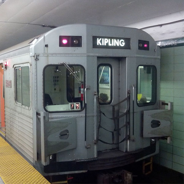
TTC subway train (ViaAmtrakGuy, Wikimedia Commons)
TTC subway train (ViaAmtrakGuy, Wikimedia Commons)
How does this align with my curriculum?
Learn about how we can use spatial analysis to plan for more equitable public transit.
Think about all the places that your family goes in a given week. People in your family might go to school, workplaces, grocery stores or to a doctor’s office. Your daily choices are often shaped by how long it takes to get to these places. For example, you probably don’t want to go to a grocery store that is 4 hours away from your house! Having services and stores close to your home saves you time and makes your life easier.

Image - Text Version
Shown are people sitting on a public bus. In the center of the frame, a man in his mid-twenties with dark-brown skin and mid-length natural hair is sitting beside a a woman in her mid-twenties with light brown skin and long naurallly curly hair. She is wearing dark-rimmed glasses. The woman is gesturing with her hands. Both are smiling. A man in his mid-twenties with white skin and light brown hair, mustache and short beard is shown in the row of seats in front of them. A young body with pale white skin and brown hair is sitting by the window in the row behind them.
What is spatial analysis?
Planners use spatial analysis to make design decisions about cities. Spatial analysis is a way of interpreting geographic information to answer questions. Whether you know it or not, you’re doing spatial analysis every time you look at a map. For example, take a look at this map of the Toronto Subway.

Image - Text Version
Shown is a map of the Toronto subway system in 2018. Four lines are shown. Line 1 is shown in yellow. It makes a long U shape that cuts across the city from north to south. Line 2 is shown in green. It goes across the city from east to west. It curves up to the right at the east end of the line. Line 3 is shown in blue. It extends off the eastern end of Line 2. It goes north for a short distance that turns sharply to the right and extends a short distance. Line 4 is shown in purple. It extends to the east off of the Sheppard-Yonge stop on Line 1.
Q1: Which line would you take to get from Kipling Station to Woodbine station?
Figuring out how to get from one point to another on a map is a simple form of spatial analysis. We use computers to do more complex forms of spatial analysis. Geographic information systems (GIS) connect data to a location on a computerized map. GIS helps us answer more complicated questions. For example, we can attach data from the Census or household surveys to locations. GIS allows us to then look for patterns in this data. Let’s take a look at an example of how people are using GIS to build more livable cities.
Did you know?
The first computerized GIS system was developed in Canada in the 1960’s. This system tracked natural resources and land usage.
Spatial Analysis in Action: Transit and Access to Jobs in Toronto
Being able to access jobs is an important part of a healthy city. In a big city like Toronto, Ontario, public transit is often the most affordable way of getting around. Planners at Jacobs used GIS to investigate the question:
How will new public transit lines impact the most vulnerable neighbourhoods in Toronto?
Q2: What information would you need to answer this question?

Image - Text Version
Shown is a map of Toronto with the grid points and networks used in this analysis. The grid points are shown as small black dots. There are thousands of them around the city. The networks are show as black lines of varying thicknesses.
Next, they included a network showing the ways people get around. This included sidewalks, roads, subways and bus routes. This allowed them to calculate how long it would take for a person to travel from a grid point to any other grid point.
Let’s take a look at how they analyzed the journey from a single grid point to another grid point. If you were on that journey, it would look something like:
- Leaving your house and walking to the sidewalk
- Walking along the sidewalk to the bus stop
- Getting on the bus and travelling along the road
- Transferring to another bus and travelling along more roads
- Getting off the bus
- Walking along the sidewalk and into your school

Image - Text Version
Shown is a colour illustration of a city street illustrating the steps that someone would take to journey from one grid point to another. Three yellow public buses are shown on the street. Several people are waiting at a bus stop. Other people are crossing a street or going underground into the subway. A street sign that says "Main St" is visible. Tall blue buildings with black windows are in the background.
The way the analysis sees that journey is:
- Getting from the grid point on to the network
- Travelling along the network using the shortest path
- Getting off the network and back to another grid point.
Let’s take a look at the math behind these steps.

Image - Text Version
Shown is an illustration of how a triangle can be used to identify the shortest distance between two points. There is a small grey line drawing of an image of a house at the top left. The house is at the topmost vertex connected to the hypotenuse of a right triangle. A road crosses through the image below the triangle. One point on the road is at the another vertex connected to the hypotenuse of the triangle. The third vertex of the triangle is beside the right angle. The triangle sides are labelled a,b, and c. Side a is the horizontal side, side b is the vertical side and side c is the diagonal side.
Q3: Use the Pythagorean theorem to find the length of X.

Image - Text Version
Shown is a line drawing of a right angle triangle. It has a vertical side labelled as 8 and a horizontal side labelled as 6. These sides are coloured black. The diagonal side is coloured red and has the label "x". A small square is located at the vertex across from the diagonal side. This indicates that the angle is 90 degrees.
The next step involves travelling along the network using the shortest path. This step uses Dijkstra’s algorithm to find the shortest path of travel along the network. The algorithm is very efficient because it doesn’t look at every possible route from start to end. While it calculates the time for every possible route as it moves away from the starting point, it always keeps track of which of those possible routes is the shortest at any given time. As it moves outwards in search of the end, it prioritizes what appears to be the shortest path first and keeps moving in that direction. Once it finally reaches the end, it knows that the first (and only) possible path to do so, is the shortest path.
To do this, the algorithm adds up every part of the shortest path. This means it adds up the time to walk along the sidewalk from your home to the bus stop. Then it does the same for waiting for the bus, riding the bus and transferring to another bus. Finally it looks at the time for riding that bus, and walking along the sidewalk to your school. As it does the time calculations on the network, it moves outwards as shown in the image until it finds the destination.
The spatial analysis repeats this process many times over for each grid point to every other grid point. This means that the number of calculations grows exponentially by the number of grid points, squared. In the analysis for the TTC, that was over 28 billion calculations (167 8822 = 28 184 365 924)!

Image - Text Version
Shown are three maps showing all the possible routes from home to school. The map on the left shows blue lines with routes that extend only a short distance from the home. The center map shows routes that extend from home to about halfway to school in many directions. The map on the right shows all the routes that connect home to school.
The third step again uses the Pythagorean theorem to move from the network to a grid point.
Planners at Jacob used GIS to complete these three steps for every single grid point. If the travel time from one point to another was less than 45 minutes, they counted the number of jobs and people at that end point. They analyzed this using both current and future transit options. Finally, they created a map showing how access to jobs would change for each location in Toronto with the addition of new transit.

Image - Text Version
Shown is a map of Toronto showing improved access to jobs using an updated transit route. Current transit routes are shown with grey lines. Future transit routes are shown with black lines. Neighbourhoods are shown in different colours. The colours correspond to the percentage of additional jobs people in that neighbourhood would be able to access with these proposed transit projects. Areas with a lesser percentage change are shown in yellow and orange. Areas with a greater percentage change are shown in pink and blue. The areas with the greatest percentage change are shown around the future rapid transit and express routes.
Q4: What do you notice about the locations of jobs compared to the new transit routes?
This map shows how future transit projects could improve job access. It also highlights which neighbourhoods would benefit the most from these projects. This data was then compared with indicators of neighbourhood well-being. This allows planners to identify which neighbourhoods need transit improvements the most.

Image - Text Version
Shown is a colour photograph of a streetcar on tracks moving down the centre of a street in Toronto. The streetcar is red and white with glowing headlights on the front. It is long and rectangular-shaped. It is attached to cables which run above it down the middle of the street at about the height of a two-story building. Two and three-story buildings line the street. The CN tower is visible stretching into the sky in the background.
Let’s Talk Science appreciates the work and contributions of Tim Dickinson and Michael Grant of Jacobs in the development of this Backgrounder.

About Jacobs
At Jacobs, we're challenging today to reinvent tomorrow by solving the world's most critical problems for thriving cities, resilient environments, mission-critical outcomes, operational advancement, scientific discovery and cutting-edge manufacturing, turning abstract ideas into realities that transform the world for good. With approximately $14 billion in revenue and a talent force of more than 55,000, Jacobs provides a full spectrum of professional services including consulting, technical, scientific and project delivery for the government and private sector.
ANSWERS
Q1: Line 2- Green
Q2: Answers vary. May include data such as commute times, employment opportunities, population estimates, routes of current transit projects, and routes of future transit projects.
Q3: a2 + b2 = c2
62 + 82 = c2
100 = c2
√100= c
10 = c
Q4: Close to future transit projects
Learn More
Geographic Information Systems Manager Career Profile
Explore Stacey Corbett’s career profile from Let’s Talk Science to learn more about careers in spatial analysis.
Spatial Information Analyst Career Profile
Explore Ralph Renso Ronquillo’s career profile from Let’s Talk Science to learn more about careers in spatial analysis.
Introduction to GIS
Explore this interactive module from Esri Canada to learn more about GIS.
References
Esri (2013). The Language of Spatial Analysis. Esri: Redlands.
Hertel, S., R. Keil and M. Collens (Feb 2016). Next Stop Equity: Routes to fairer transit access in the Greater Toronto and Hamilton Area. The City Institute at York University.
Jacobs (Dec 21, 2020) 360 Transit Alliance Joint Venture Selected to Lead Project Controls for Four Toronto Subway Lines.
King, D. and A.S. Shalaby (2016). Performance Metrics and Analysis of Transit Network Resilience in Toronto. Presented at the 95th Annual Meeting of the Transportation Research Board, Washington, D.C.
McCarty, B.A. (Jan 31, 2012). G-FAQ - What Is The Difference Between A Map And Spatial Analysis? Apollo Mapping.